Materials in Design
An Interview with Kari Pei, product designer
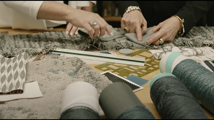
Louis Kahn famously told his students to interrogate their materials for design inspiration. The modernist architect would phrase this advice as hypothetical dialogue: “You say to a brick, ‘What do you want, brick?’ And brick says to you, ‘I like an arch.’ And you say to brick, ‘Look, I want one, too, but arches are expensive and I can use a concrete lintel.’ And then you say: ‘What do you think of that, brick?’ Brick says: ‘I like an arch.’”
Kahn’s quote has become a shorthand way of referring to honesty in one’s material selections. And while he meant for a building’s form to follow its chosen materials’ inherent traits, over her career, Interface global product designer Kari Pei has found that certain interiors specifiers have taken that principle in a different direction. They pursue honesty in their work, by avoiding materials that imitate other materials.
So, when Interface launched LVT in early 2017, Pei realized she had to pursue two strategies. First, she needed to amass an inventory of “wardrobe basics”: trompe l’oeil wood- and cement-patterned tiles, which most designers could source as more affordable, higher-performing alternatives to wood planks and polished concrete. Second, Pei determined to design LVT patterns that would sate the honesty seekers. “You need to have tile that can’t look like anything else,” says the designer, who has just completed the Drawn Lines™ collection of LVT.
Pei began clarifying an alternative vision of Interface LVT in two previous global collections. “With Boundary Metallics™, we wanted to do something that was organic but didn’t look like wood, cement, or stone,” for example, and the results resembled the beautifully messy floor of an artist’s studio. Meanwhile, for Studio Set™, Pei reduced the color contrast on woodgrain-stamped print cylinders so that those tiles would appear more like a wash of color with a subtle organic pattern underneath. “If you’re creating any kind of product, you want people to have some kind of emotional connection with them,” the designer says of the product development experience. “Whether it’s a toothbrush, a chair, or flooring, you want to make them feel some way.”
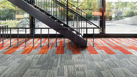
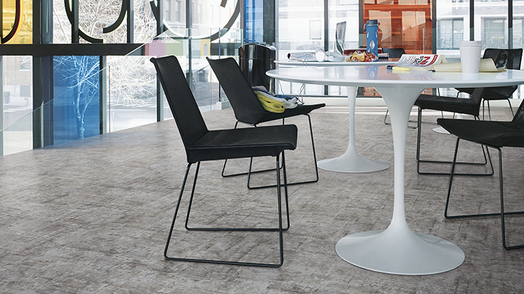
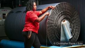
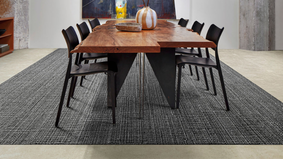
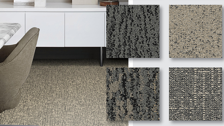
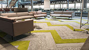
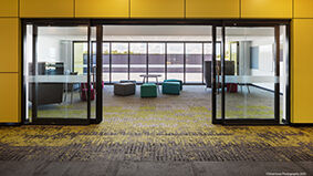
Pei conceived Drawn Lines as a response to another widely-employed faux pattern—woven textures. While the new collection’s lines are more crisply geometric than the warp and weft of fabric, Pei has manipulated the print cylinders so that “one-point lines fade differently on each of the rollers, which creates movement and softness as well as a sense of surface depth.” That gradation allows Drawn Lines to diverge farther from merely replicating woven fabric, Pei adds, because it “behaves like cement without masquerading as it.”
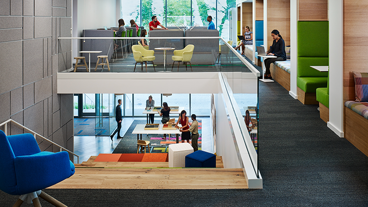
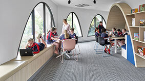
The aesthetic of Drawn Lines also has a functional payoff, as the pattern can deftly hide the occasional scuff mark, and Pei is excited to see how the collection may be applied to high-traffic spaces like education interiors, where, according to research published in Building and the Environment, excellent classroom design has a 25 percent positive impact on students’ scholastic potential. And she feels enthusiastic about LVT’s place in the Interface family overall, because the new tiles have the same backing as other product lines and requires no transition strips. “We conceived LVT as part of an integrated system, making design and installation a much more seamless process.”
